What Is the 60/40 Rule in Interior Design? Colour Balance Explained
Read Time:4 Minute, 5 Second
The 60/40 rule in interior design, commonly called the 60–30–10 rule, defines colour distribution using 60 percent dominant colour, 30 percent secondary colour, and 10 percent accent colour across room surfaces to create visual balance within spaces typically measuring 10–25 m².
This rule structures the visual hierarchy.
A room without proportion feels chaotic. A room with defined distribution feels controlled, readable, and cohesive from the moment you enter.
What is the 60/40 rule in interior design?
The 60/40 rule in interior design is a colour proportion system allocating 60 percent of visual space to a dominant colour, 30 percent to a secondary colour, and 10 percent to an accent colour to establish hierarchy and balance.
The rule is mathematical.
A 20 m² room assigns approximately 12 m² visual dominance to one colour, 6 m² to a secondary tone, and 2 m² to accents. This distribution aligns with how the human visual system processes contrast and grouping.
Why does the 60/40 rule create balanced spaces?
The 60/40 rule creates balanced spaces because dominant colour establishes visual stability, secondary colour introduces contrast without conflict, and accent colour directs attention, preventing equal visual competition across elements.
Balance depends on hierarchy.
Equal colour distribution creates visual noise. The rule avoids this by controlling dominance levels. According to colour theory principles, contrast and proportion determine how the eye prioritises elements in a space.
Where should the 60 percent dominant colour be applied?
Dominant colour in the 60/40 rule should be applied to walls, large furniture, or flooring covering the largest continuous surfaces, typically representing 50–70 percent of visible area within a room.
Large surfaces define perception.
Walls alone often cover over 40 percent of visible space. Adding a sofa or flooring completes the 60 percent allocation. Neutral tones such as grey, beige, or white commonly serve this role due to adaptability.
How should the 30 percent secondary colour be used?
Secondary colour in the 60/40 rule should be applied to medium-scale elements such as sofas, rugs, curtains, or cabinetry, covering approximately 25–35 percent of visible space to support the dominant colour without overpowering it.
Secondary colour builds structure.
This layer introduces variation while maintaining cohesion. Upholstery and textiles commonly carry this percentage because they occupy consistent visual zones without dominating the room.
What counts as the 10 percent accent colour?
Accent colour in the 60/40 rule should be applied to small-scale elements such as cushions, artwork, decorative objects, and lighting, covering approximately 5–15 percent of visible space to create focal points and visual movement.
Accents guide the eye.
Small colour placements influence attention more than surface area suggests. Strategic placement near focal points such as coffee tables or shelving increases perceived impact.
How many accent colours can be used within the 10 percent?
Accent colour allocation in the 60/40 rule can include one to three colours within the 10 percent range, with two accent colours providing optimal balance between cohesion and visual interest in rooms under 25 m².
Accent count affects complexity.
One accent colour creates simplicity. Two adds depth. Three introduces richness but requires careful coordination to avoid visual fragmentation.
How does room size affect the 60/40 rule?
Room size affects the 60/40 rule by altering colour distribution scale, with smaller rooms under 15 m² benefiting from lighter dominant colours to increase perceived space, while larger rooms over 25 m² support darker or more saturated palettes.
Scale changes perception.
Light colours reflect up to 80 percent of light, increasing brightness in compact spaces. Larger rooms tolerate darker tones without reducing perceived openness.
How can you apply the 60/40 rule step by step?
Applying the 60/40 rule requires selecting a dominant colour for large surfaces, assigning a complementary secondary colour to furniture and textiles, and distributing accent colours across small decorative elements to achieve proportional balance.
Use this framework.
- Choose dominant colour for walls or flooring
- Select secondary colour for main furniture pieces
- Add accent colour through accessories and decor
- Verify proportions visually across the room
- Adjust placement until no colour competes equally
This process ensures controlled visual distribution.
Where can you see real examples of the 60/40 rule in practice?
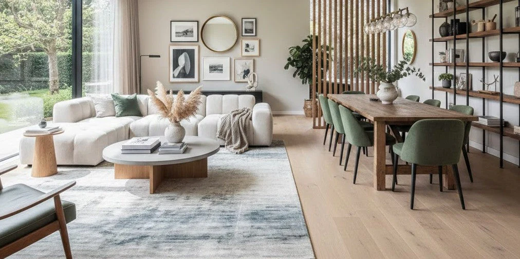
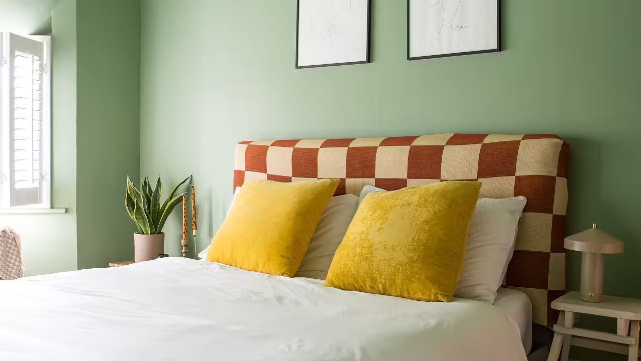
Interior design examples of the 60/40 rule appear across living rooms, bedrooms, and open-plan spaces where colour distribution aligns with furniture placement, lighting, and architectural features.
You can also browse full furniture collections such as https://petalwoodinteriors.co.uk/ to see how colour balance integrates with material and layout choices.
Final takeaway: how should you use the 60/40 rule?
The 60/40 rule should be used as a proportional framework that assigns visual hierarchy through colour distribution, ensuring dominant, secondary, and accent elements work together to create cohesive, functional, and visually balanced interiors.
The rule simplifies decisions.
It removes guesswork and replaces it with structure.
Happy
0 %
Sad
0 %
Excited
0 %
Sleepy
0 %
Angry
0 %
Surprise
0 %

Average Rating